ItsRainingRaincoats
ItsRainingRaincoats
ItsRainingRaincoats
Streamlining Donation and Volunteering Process to Better Involve Benefactors
Streamlining Donation and Volunteering Process to Better Involve Benefactors
Streamlining Donation and Volunteering Process to Better Involve Benefactors
Background
Background
Background
ItsRainingRaincoats(IRR), as one of the Singapore local social initiatives dedicating to the welfare and integration of migrant workers in Singapore, has been pioneering in developing programs that support worker brothers from the ground up.
ItsRainingRaincoats(IRR), as one of the Singapore local social initiatives dedicating to the welfare and integration of migrant workers in Singapore, has been pioneering in developing programs that support worker brothers from the ground up.
Currently, ItsRainingRaincoat serves three distinct user groups: donors, volunteers, and migrant workers. The organization also runs a variety of charitable initiatives, each with different focuses and processes.
Currently, ItsRainingRaincoat serves three distinct user groups: donors, volunteers, and migrant workers. The organization also runs a variety of charitable initiatives, each with different focuses and processes.
My Role
My Role
My Role
This is a group project.
This is a group project.
UX Designer
UX Designer
UX Designer
User Research, UX Design, Prototyping & testing
User Research, UX Design, Prototyping & testing
Project Manager
Project Manager
Project Manager
Project Management
Project Management
Project Duration
Project Duration
Project Duration
3 Weeks (July - August 2024)
3 Weeks (July - August 2024)
Platform
Platform
Platform
Mobile
Mobile
Challenges
Challenges
Challenges
Since IRR's objective is to engage volunteers and donors to participate in their initiatives while organizing support activities for migrant workers.
Since IRR's objective is to engage volunteers and donors to participate in their initiatives while organizing support activities for migrant workers.
Due to the diversity of target audience types, varying user purposes, the large number of organized activities, and the complexity of the its operation, IRR needs to display extensive text and images to convey event information and spark user interest.
Due to the diversity of target audience types, varying user purposes, the large number of organized activities, and the complexity of the its operation, IRR needs to display extensive text and images to convey event information and spark user interest.
Currently, the IRR website fails to prioritize essential information and instead overpopulates the homepage and main touchpoints with content that is not relevant to the user.
Currently, the IRR website fails to prioritize essential information and instead overpopulates the homepage and main touchpoints with content that is not relevant to the user.
This, in turn, causes user confusion and even frustration, especially for first-time users, as they struggle to quickly find relevant information or complete intended actions on the IRR homepage.
This, in turn, causes user confusion and even frustration, especially for first-time users, as they struggle to quickly find relevant information or complete intended actions on the IRR homepage.
Missions
Missions
Missions
Our missions here are:
Understand potential contributors’ behaviours when interacting with social initiatives online;
Revamp the existing IRR website and create a unified and simplified design that delivers a streamlined, cohesive experience for all relevant user types;
Help IRR better convince and convert potential contributors to partake in the initiatives.
User Interview
User Interview
User Interview
Our design aims to address target users’ needs and goals when engaging with a charitable organization’s site, ultimately enhancing the user experience. To gain in-depth insights and uncover hidden needs and pain points, we conducted user interviews.
Our design aims to address target users’ needs and goals when engaging with a charitable organization’s site, ultimately enhancing the user experience. To gain in-depth insights and uncover hidden needs and pain points, we conducted user interviews.
From the outset, we anticipated challenges in gathering insights from three distinct target groups, making recruitment and screening essential to high-quality interviews.
From the outset, we anticipated challenges in gathering insights from three distinct target groups, making recruitment and screening essential to high-quality interviews.
By leveraging social networks and engaging existing participants to help recruit others, we successfully conducted interviews across all target groups.
By leveraging social networks and engaging existing participants to help recruit others, we successfully conducted interviews across all target groups.
Key Insights
Key Insights
Key Insights
Knowledge of the Organisation
Contributors need a clear understanding of the NGO’s mission and values to determine if it resonates with them and inspires further commitment.
Contributors need a clear understanding of the NGO’s mission and values to determine if it resonates with them and inspires further commitment.
Program Details
Potential contributors prefer to commit only after knowing program-specific details, such as required commitment hours, event venue and expected outcomes.
Potential contributors prefer to commit only after knowing program-specific details, such as required commitment hours, event venue and expected outcomes.
Communication Platform
When seeking support, migrant workers prefer—and typically only—contact organizations directly via mobile, either by calling or messaging.
When seeking support, migrant workers prefer—and typically only—contact organizations directly via mobile, either by calling or messaging.
Usability Test on Existing Website
Usability Test on Existing Website
Usability Test on Existing Website
After an initial evaluation of the current website, we identified several issues that could hinder user interaction with IRR. To validate these findings and uncover potential pain points, we conducted usability tests to gather targeted insights.
After an initial evaluation of the current website, we identified several issues that could hinder user interaction with IRR. To validate these findings and uncover potential pain points, we conducted usability tests to gather targeted insights.
Key Insights
Key Insights
Key Insights
Key Insight 1: The program-specific information is scattered around on multiple pages, which fatigued users.
Key Insight 1: The program-specific information is scattered around on multiple pages, which fatigued users.
Program Page
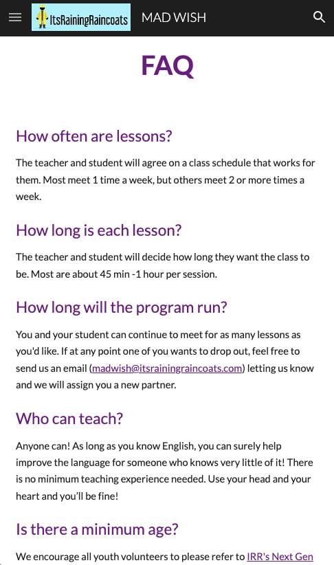
FAQ Page
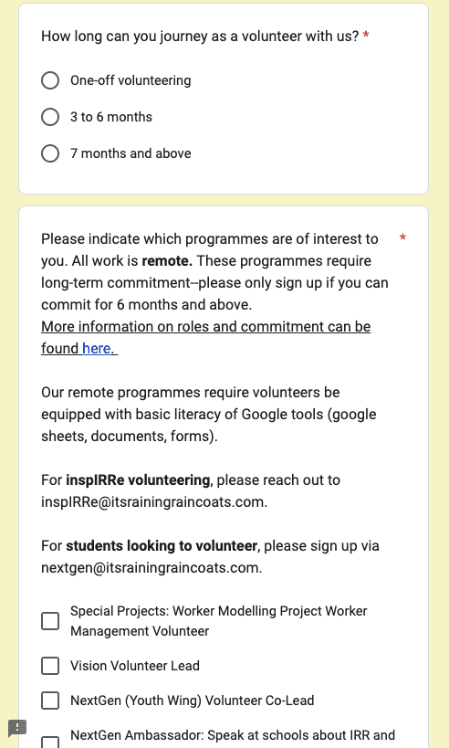
Registration Form Page
Registration Form Page
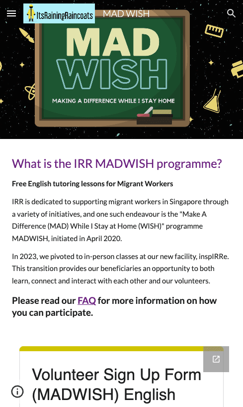
Essential information, like program entry criteria and commitment hours, can only be found on a few different pages.
Essential information, like program entry criteria and commitment hours, can only be found on a few different pages.
During usability tests, we observed that all users struggled to access essential program details, such as event location and date. They noted that this lack of information delayed their decision on whether to enroll.
During usability tests, we observed that all users struggled to access essential program details, such as event location and date. They noted that this lack of information delayed their decision on whether to enroll.
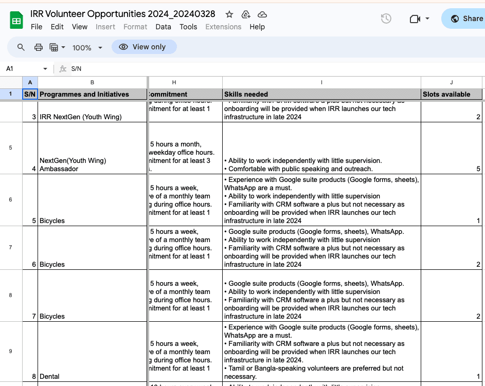
Program Information Sheet
What makes the information-retrieving process even more prolonged is that some of these pages are buried so deep within the site that they are virtually inaccessible to new users unfamiliar with the website.
What makes the information-retrieving process even more prolonged is that some of these pages are buried so deep within the site that they are virtually inaccessible to new users unfamiliar with the website.
Another reason that led to users's failure in retrieving all necessary information is that some of the information is documented on a separate Google Sheet and the navigation to this sheet involved easily 4 to 5 clicks meanwhile the CTAs led to the next page
Another reason that led to users's failure in retrieving all necessary information is that some of the information is documented on a separate Google Sheet and the navigation to this sheet involved easily 4 to 5 clicks meanwhile the CTAs led to the next page
Key Insight 2: The homepage is over-populated with content in a wordy writing style, which easily depletes users' (particularly first time users) patience during browsing.
Key Insight 2: The homepage is over-populated with content in a wordy writing style, which easily depletes users' (particularly first time users) patience during browsing.

Users tended to stop scrolling or couldn't pay attention to information that they were supposed to find during the seemingly-endless scrolling.
Users tended to stop scrolling or couldn't pay attention to information that they were supposed to find during the seemingly-endless scrolling.
Key Insight 3: Duplicate information appears across multiple pages, while content of related topics is unnecessarily divided across menu sections.
Key Insight 3: Duplicate information appears across multiple pages, while content of related topics is unnecessarily divided across menu sections.
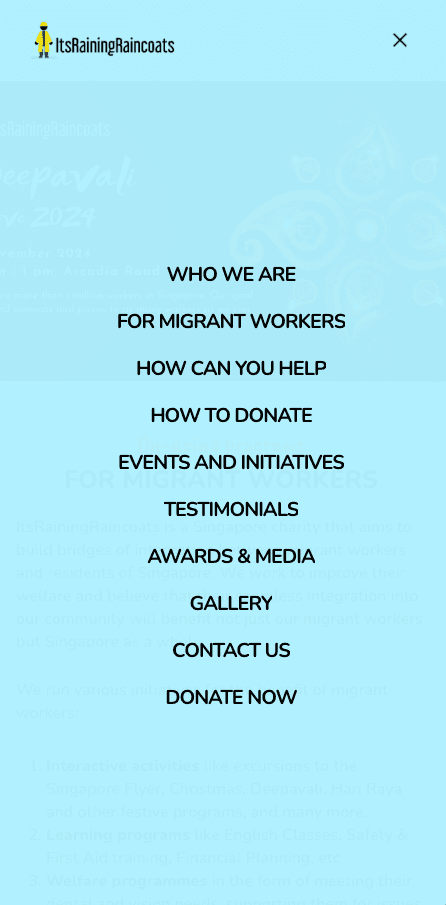
Users found it confusing to see identical information about volunteer and donation programs across multiple pages (brown box in the image on the left).
Users found it confusing to see identical information about volunteer and donation programs across multiple pages (brown box in the image on the left).
Similarly, they expected organization-related details, such as stories and testimonials (green boxes), to appear in one section, with media like photos, videos, and press coverage grouped together (cream-colored boxes).
Similarly, they expected organization-related details, such as stories and testimonials (green boxes), to appear in one section, with media like photos, videos, and press coverage grouped together (cream-colored boxes).
After completing user research and synthesizing research results, we set these extracted key insights as the cornerstone and from here, began exploring potential design ideas.
After completing user research and synthesizing research results, we set these extracted key insights as the cornerstone and from here, began exploring potential design ideas.
Reducing Target Groups
Reducing Target Groups
Reducing Target Groups
After conducting user interviews with migrant workers, we learned that, due to limited internet access and technology literacy, these users are entirely unfamiliar with the websites operated by organizations offering them support.
After conducting user interviews with migrant workers, we learned that, due to limited internet access and technology literacy, these users are entirely unfamiliar with the websites operated by organizations offering them support.
They also stated that even if they were aware of such sites, they would not use them to seek social support or advice. Further conversations revealed that this group typically only reaches out for help in urgent situations, and in these cases, they prefer to contact organizations directly through WhatsApp messages or phone calls.
They also stated that even if they were aware of such sites, they would not use them to seek social support or advice. Further conversations revealed that this group typically only reaches out for help in urgent situations, and in these cases, they prefer to contact organizations directly through WhatsApp messages or phone calls.
Meanwhile, the research into the behaviors of Donor and Volunteer users revealed that both user types are receptive to learning about the charity organization and participating in charitable activities through the website.
Meanwhile, the research into the behaviors of Donor and Volunteer users revealed that both user types are receptive to learning about the charity organization and participating in charitable activities through the website.
Therefore, we confirmed on our decision that the redesigned web App would would not focus on the migrant worker user group.
Therefore, we confirmed on our decision that the redesigned web App would would not focus on the migrant worker user group.
Developing with Design Thinking
Developing with Design Thinking
Developing with Design Thinking
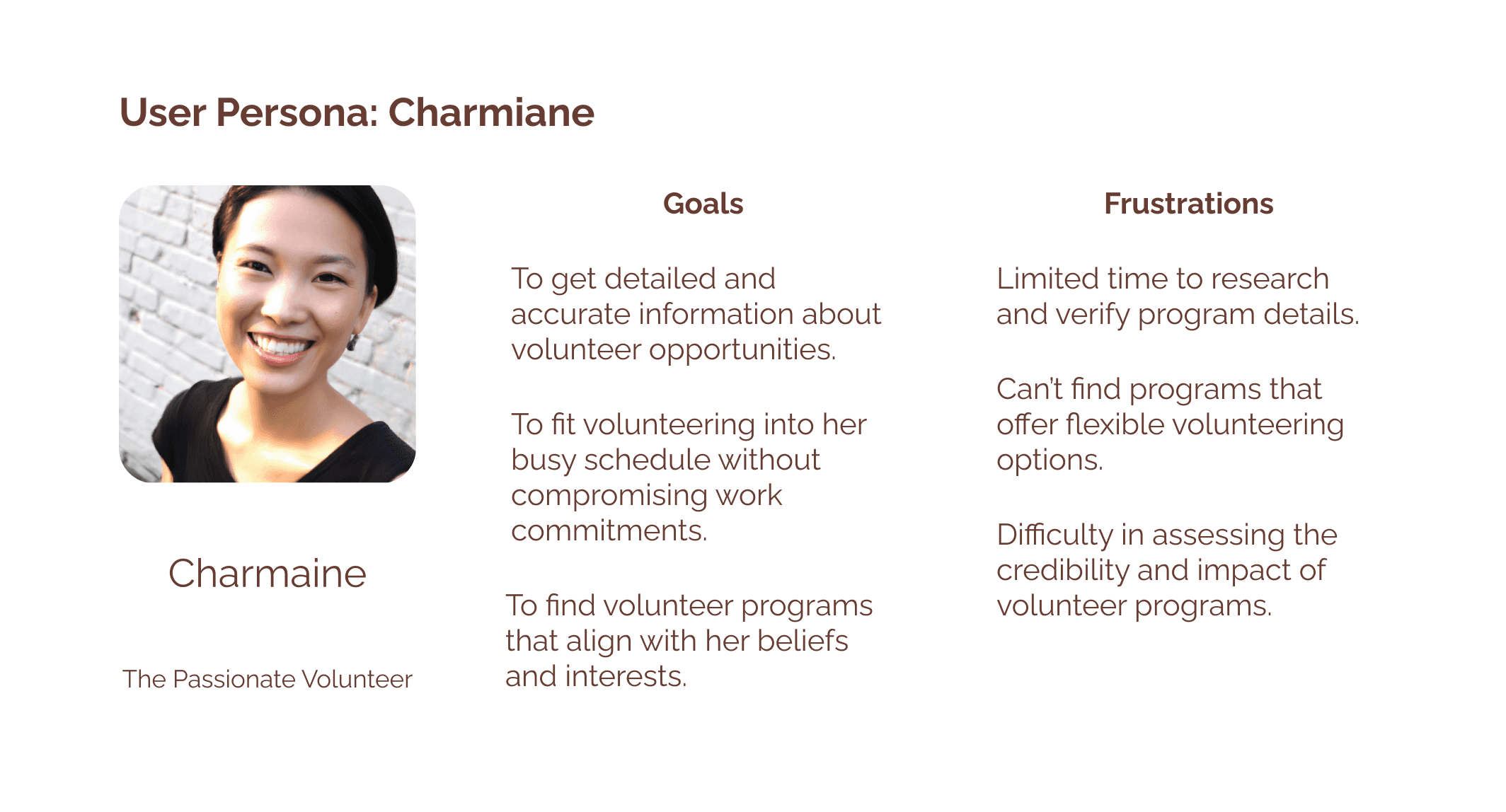
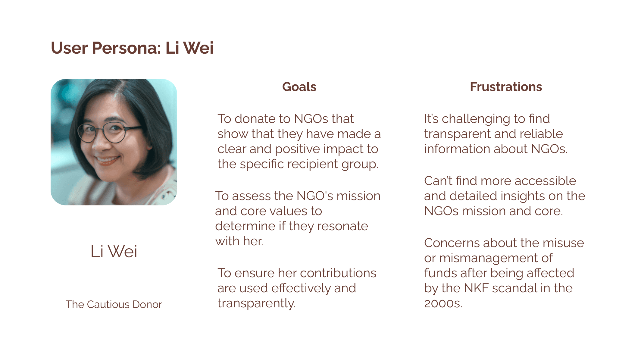
The research clearly showed that different user groups engage with the app in distinct ways. To address this, we created two user profiles, each based on specific goals and tasks and explore possible problem solving angles for design solutions.
The research clearly showed that different user groups engage with the app in distinct ways. To address this, we created two user profiles, each based on specific goals and tasks and explore possible problem solving angles for design solutions.


Well-Oriented Homepage
Well-Oriented Homepage
Well-Oriented Homepage
The homepage is over-populated with content in a wordy writing style, which easily depletes users' (particularly first time users) patience during browsing.
The homepage is over-populated with content in a wordy writing style, which easily depletes users' (particularly first time users) patience during browsing.
The homepage is over-populated with content in a wordy writing style, which easily depletes users' (particularly first time users) patience during browsing.
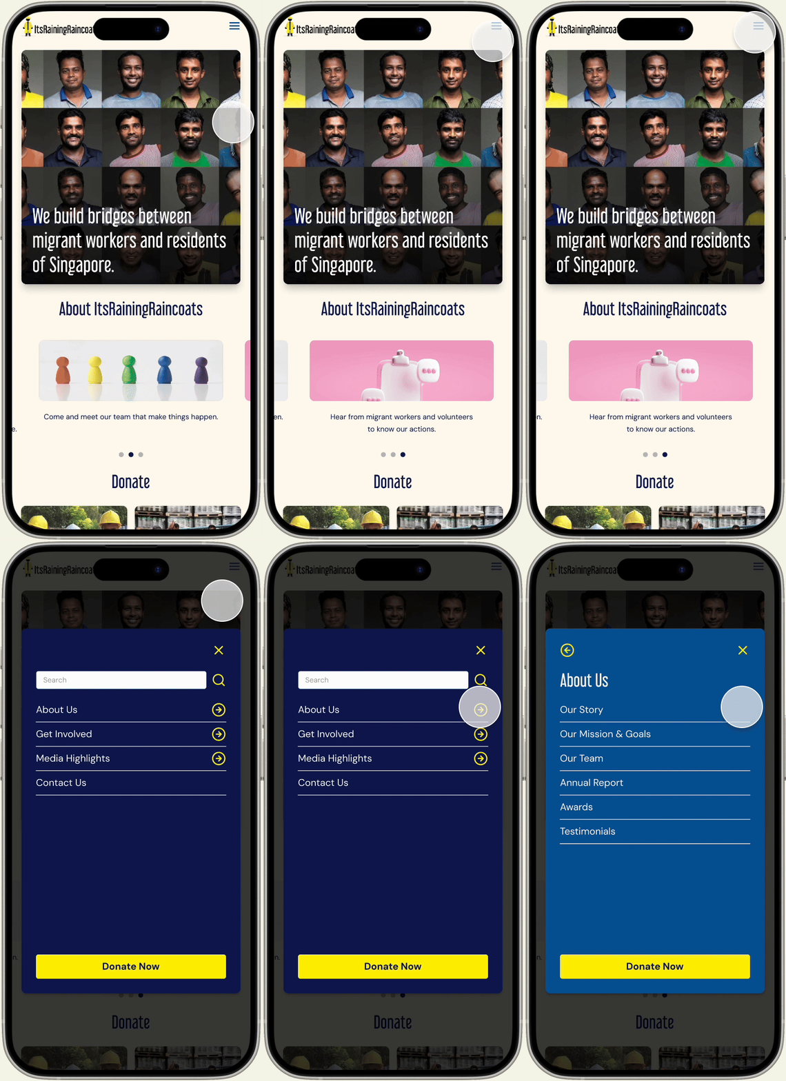
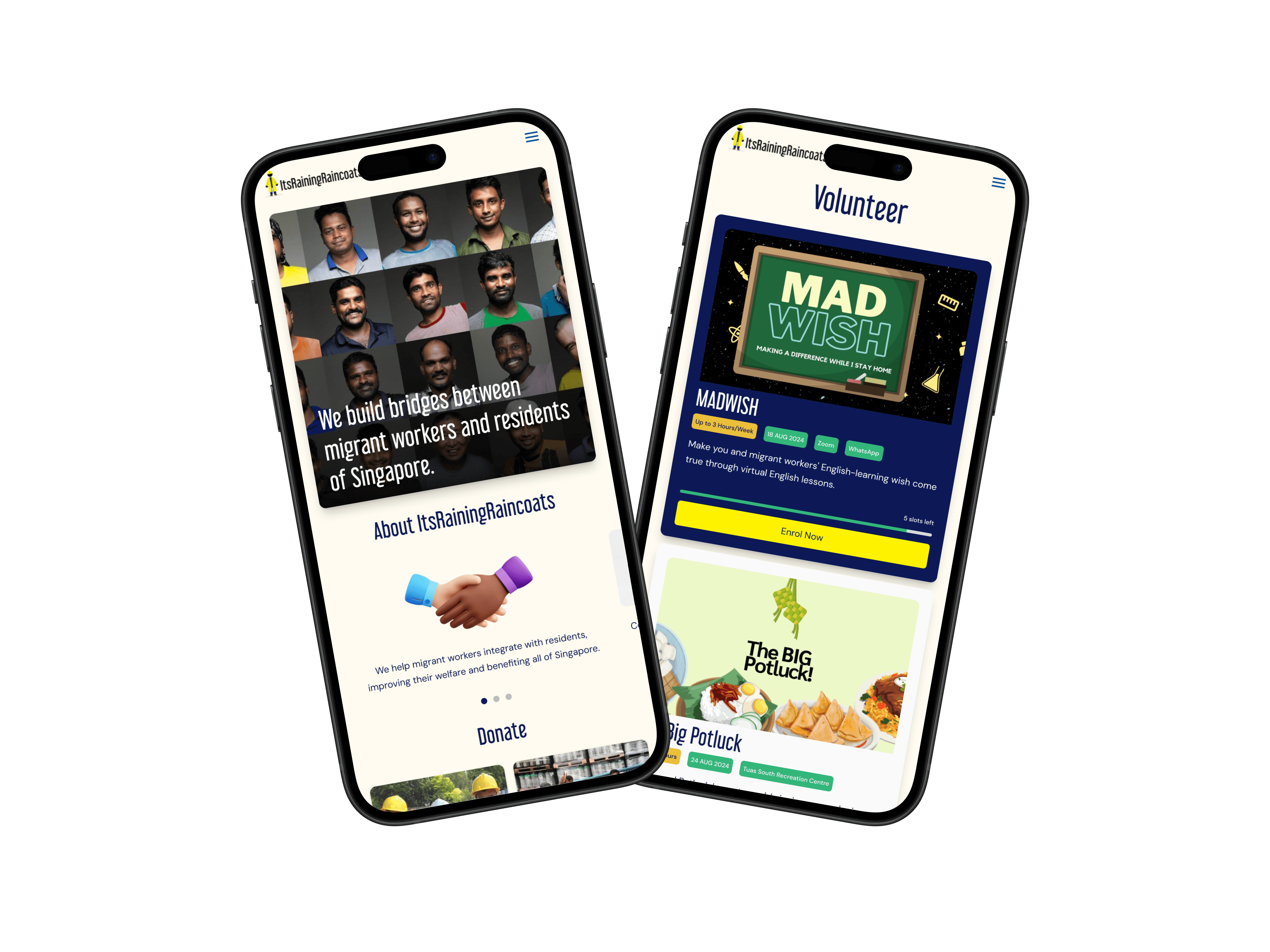
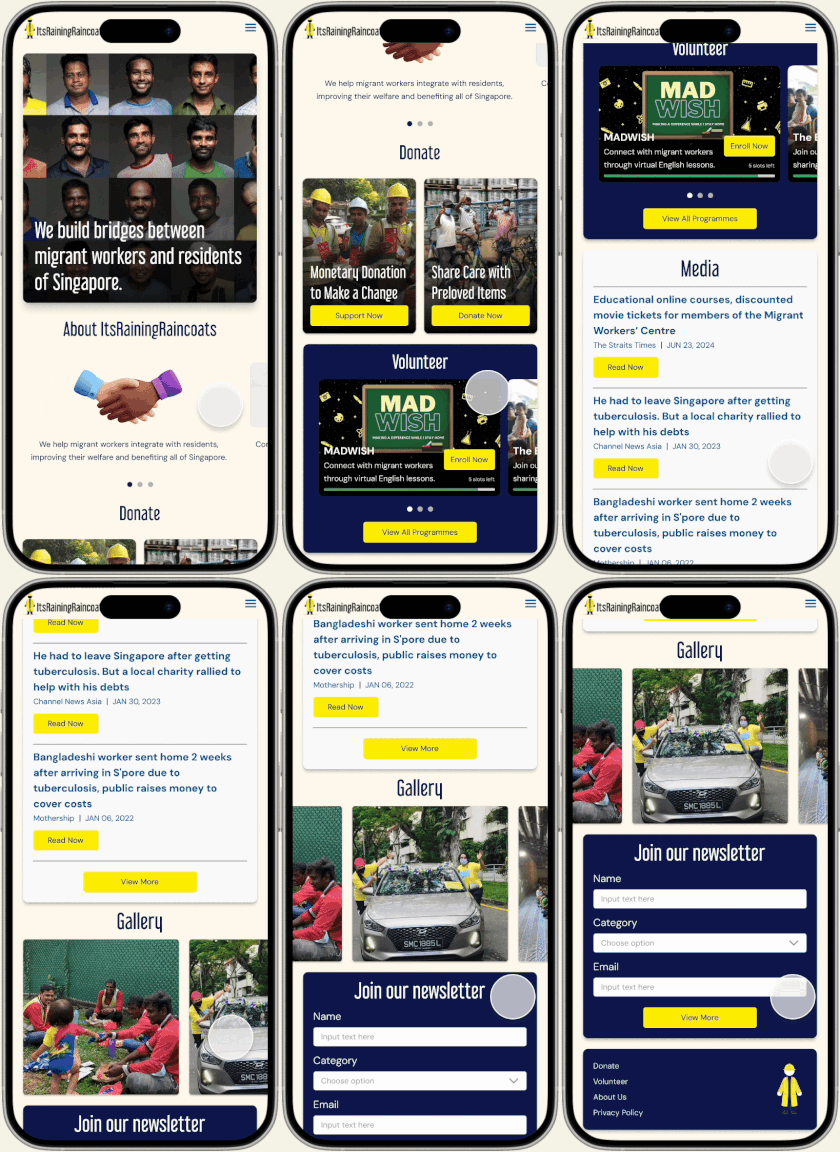
Based on user interviews and usability testing, we revamped the website's look and feel to create a modern, simple, and welcoming vibe while keeping the brand colours for consistency.
Based on user interviews and usability testing, we revamped the website's look and feel to create a modern, simple, and welcoming vibe while keeping the brand colours for consistency.
We also streamlined the homepage by removing unnecessary content that made scrolling tedious and refined the UX writing into more concise copy in digestable chunks.
We also streamlined the homepage by removing unnecessary content that made scrolling tedious and refined the UX writing into more concise copy in digestable chunks.
Global Navigation
Global Navigation
Global Navigation
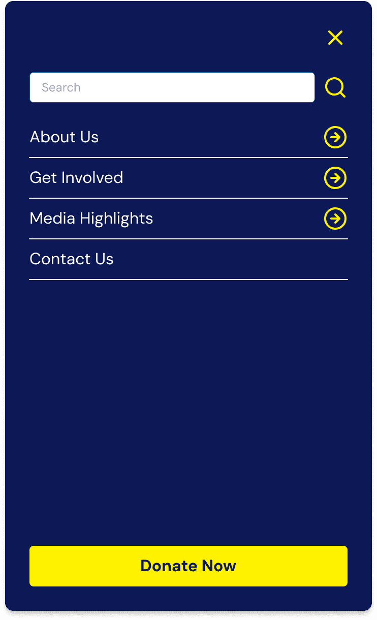
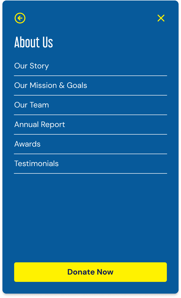
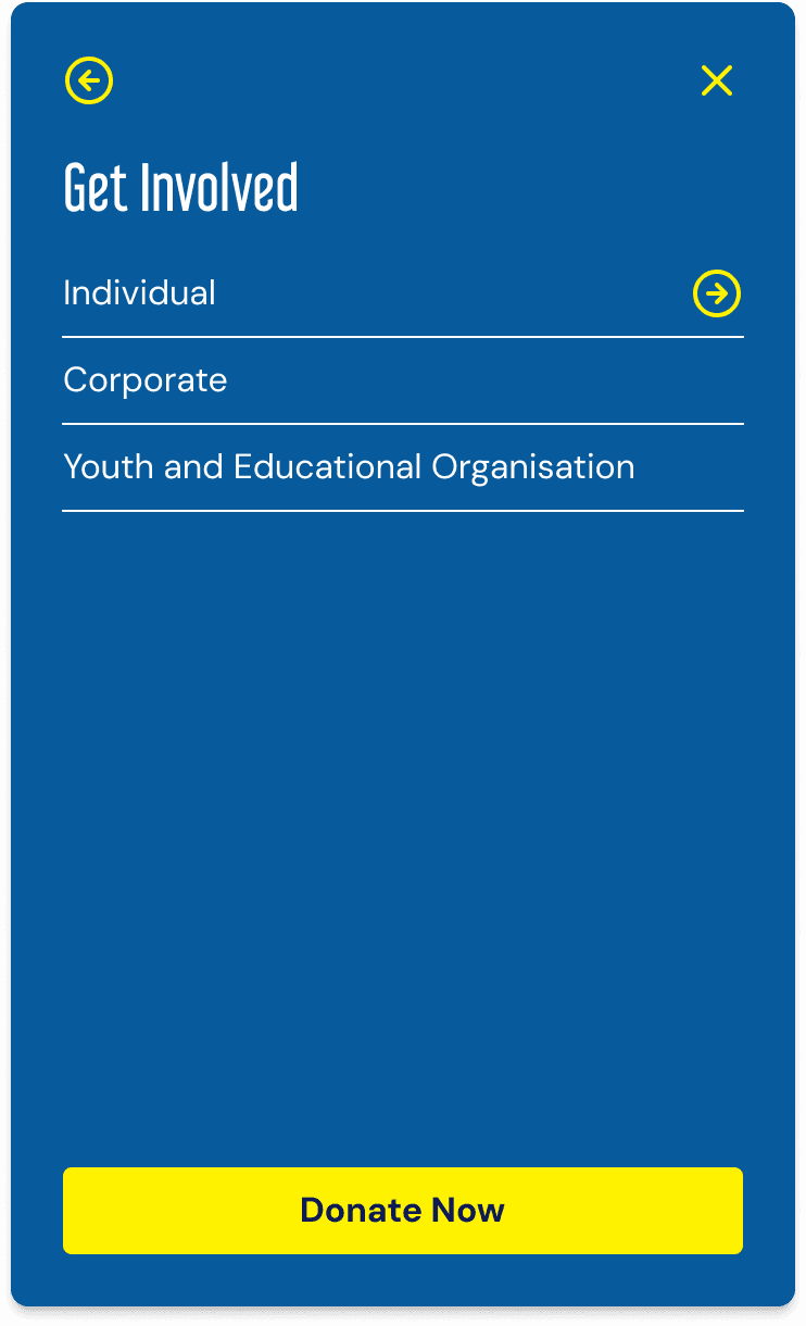
Duplicate information appears across multiple pages, while content of related topics is unnecessarily divided across menu sections.
Duplicate information appears across multiple pages, while content of related topics is unnecessarily divided across menu sections.
Duplicate information appears across multiple pages, while content of related topics is unnecessarily divided across menu sections.
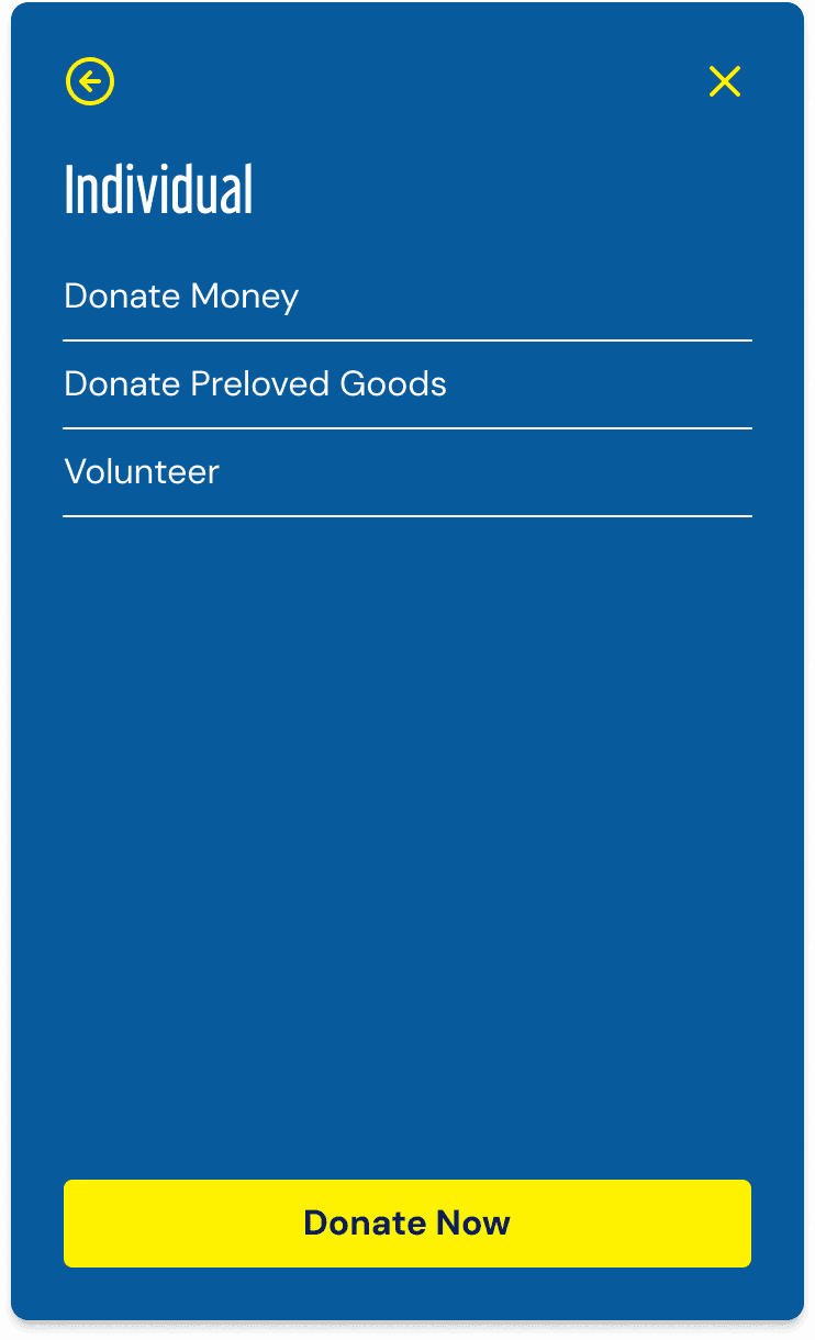
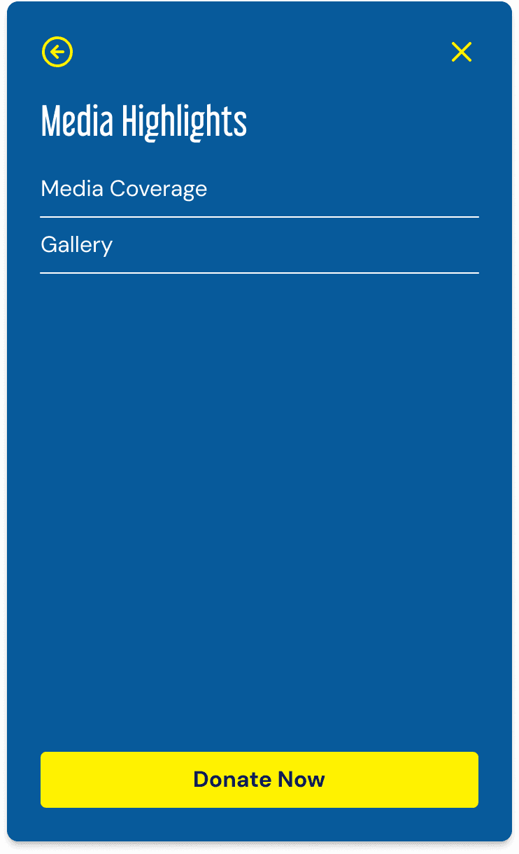
Noticing varying user expectations around the way content is organised and displayed, we redesigned the global navigation to provide a more streamlined and oriented navigation experience.
Noticing varying user expectations around the way content is organised and displayed, we redesigned the global navigation to provide a more streamlined and oriented navigation experience.
Primary Information to Build Trust
Primary Information to Build Trust
Primary Information to Build Trust
Knowledge of the Organisation: Contributors need a clear understanding of the NGO’s mission and values to determine if it resonates with them and inspires further commitment.
Knowledge of the Organisation: Contributors need a clear understanding of the NGO’s mission and values to determine if it resonates with them and inspires further commitment.
Knowledge of the Organisation: Contributors need a clear understanding of the NGO’s mission and values to determine if it resonates with them and inspires further commitment.
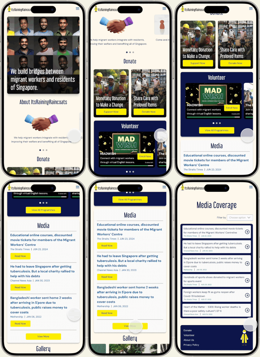
To facilitate new users' understanding of the organization and foster trust, we prominently featured the organization’s missions and goals, media coverage, and program photos on the homepage, without overcrowding it.
To facilitate new users' understanding of the organization and foster trust, we prominently featured the organization’s missions and goals, media coverage, and program photos on the homepage, without overcrowding it.
Users who want to learn more are guided to designated pages for further exploration.
Users who want to learn more are guided to designated pages for further exploration.
Media Coverage
Media Coverage
Media Coverage
Homepage - Media Section
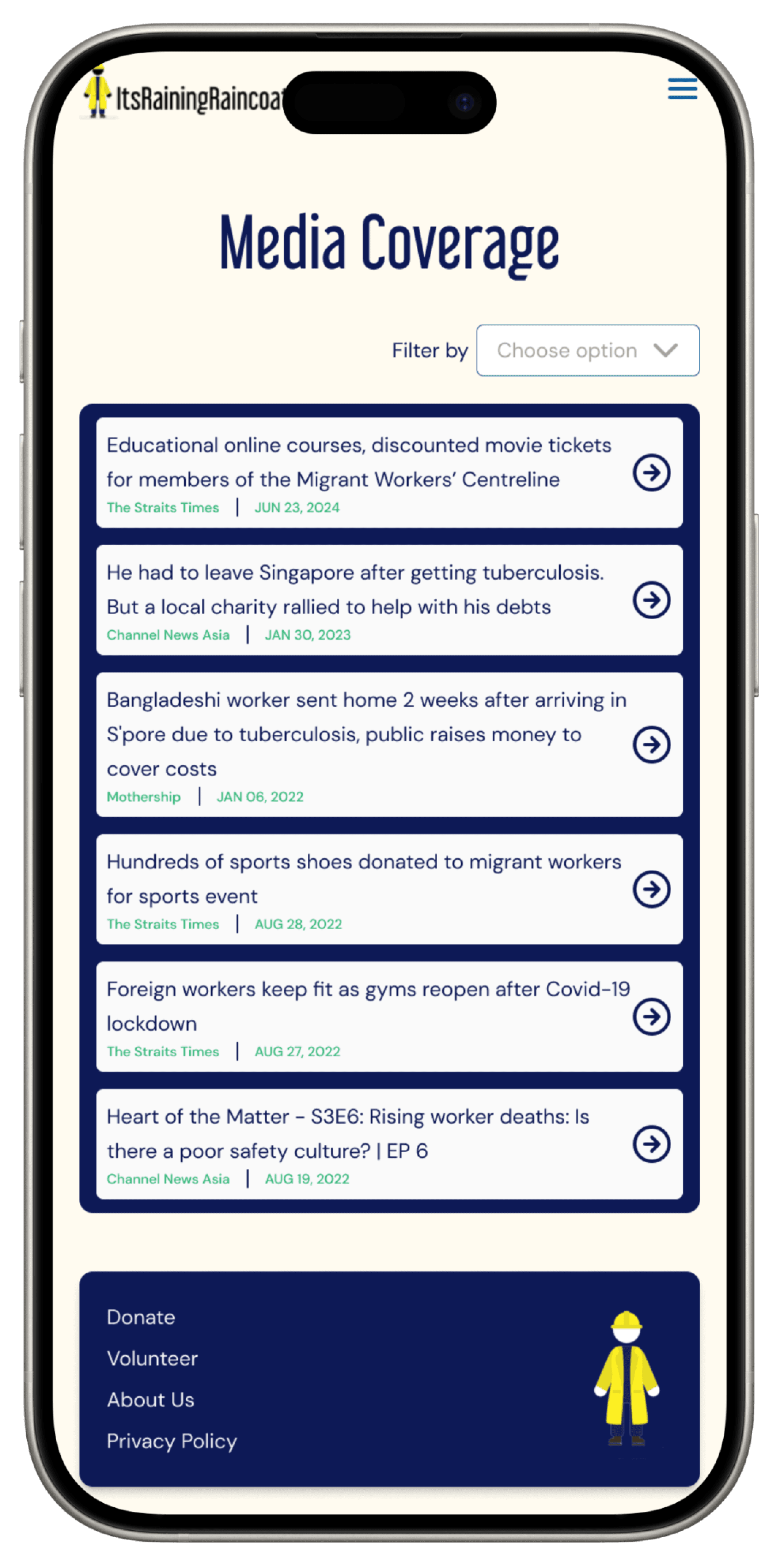
Media Coverage Page
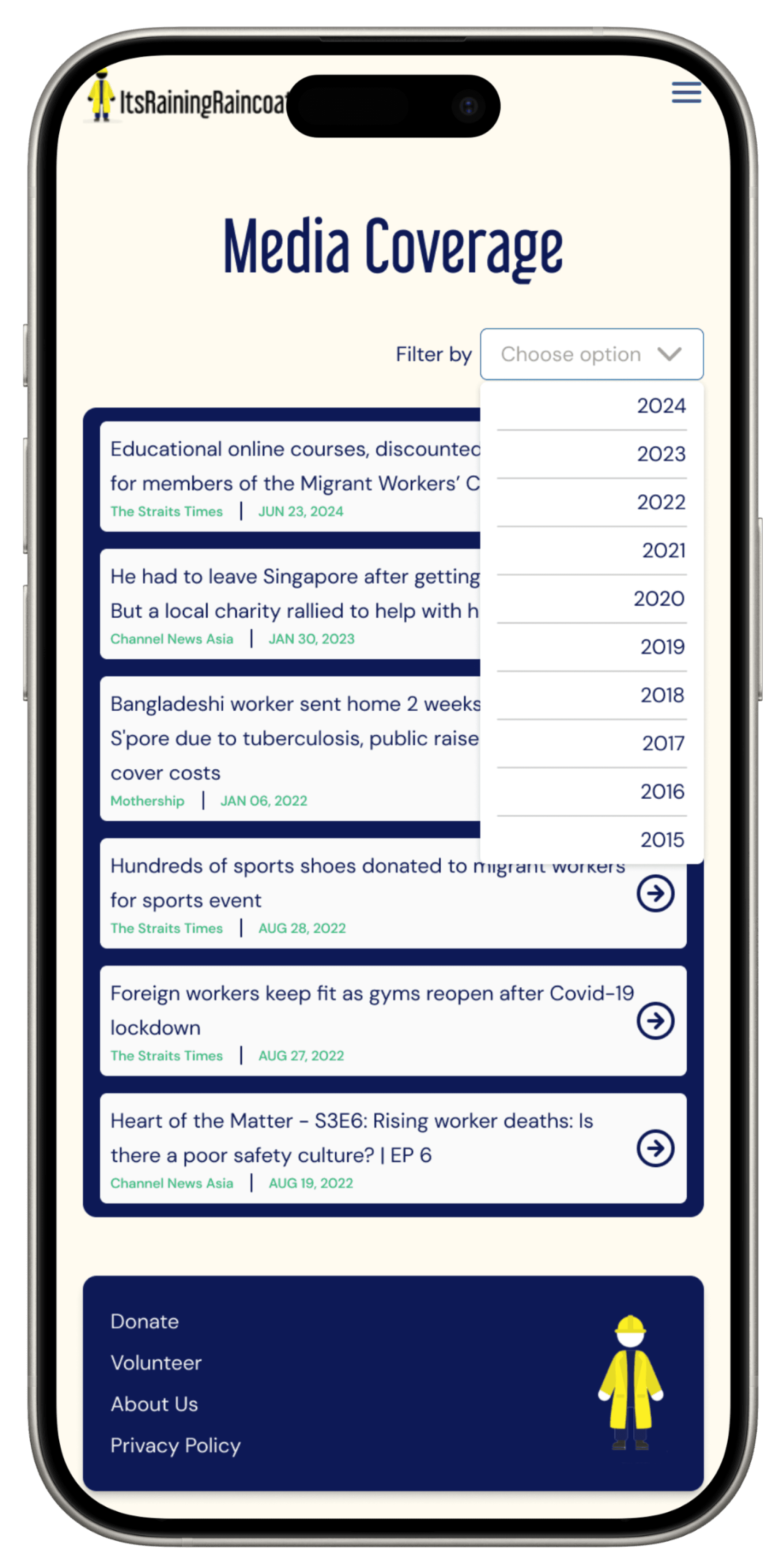
Media Coverage Page - Filtering

Media Coverage Page - Filtered Result

Homepage - Media Section

Media Coverage Page

Media Coverage Page - Filtering

Media Coverage Page - Filtered Result

Homepage - Media Section

Media Coverage Page

Media Coverage Page - Filtering

Media Coverage Page - Filtered Result

Homepage - Media Section

Media Coverage Page

Media Coverage Page - Filtering

Media Coverage Page - Filtered Result

Homepage - Media Section

Media Coverage Page

Media Coverage Page - Filtering

Media Coverage Page - Filtered Result

Homepage - Media Section

Media Coverage Page

Media Coverage Page - Filtering

Media Coverage Page - Filtered Result

Homepage - Media Section

Media Coverage Page

Media Coverage Page - Filtering

Media Coverage Page - Filtered Result

Homepage - Media Section

Media Coverage Page

Media Coverage Page - Filtering

Media Coverage Page - Filtered Result
Video and Photos of Past Programs
Video and Photos of Past Programs
Video and Photos of Past Programs
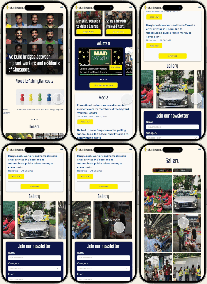
Homepage - Gallery Section
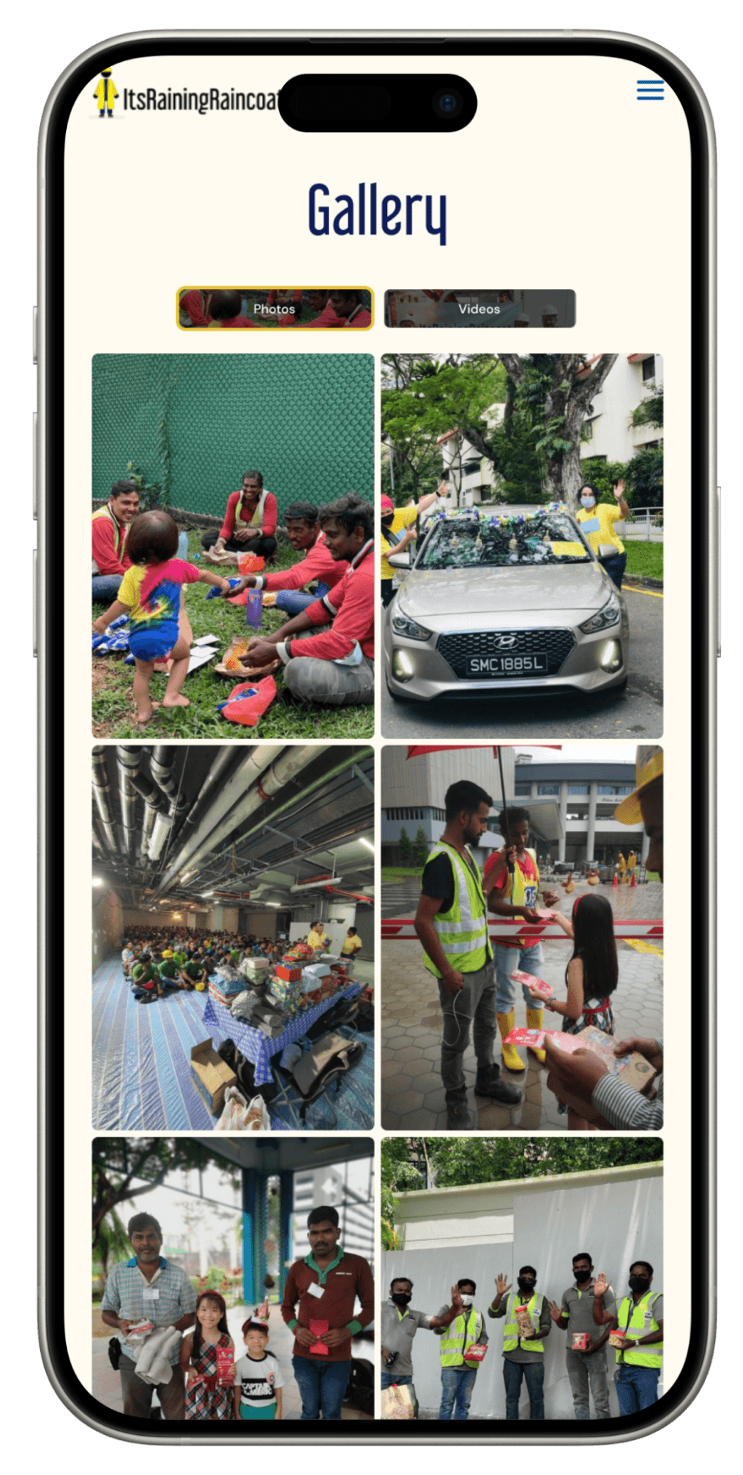
Gallery Page - Photo
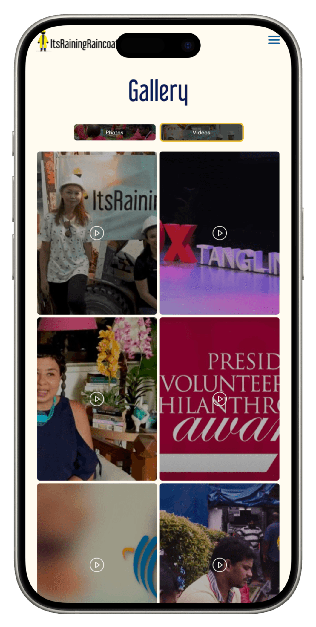
Gallery Page - Video
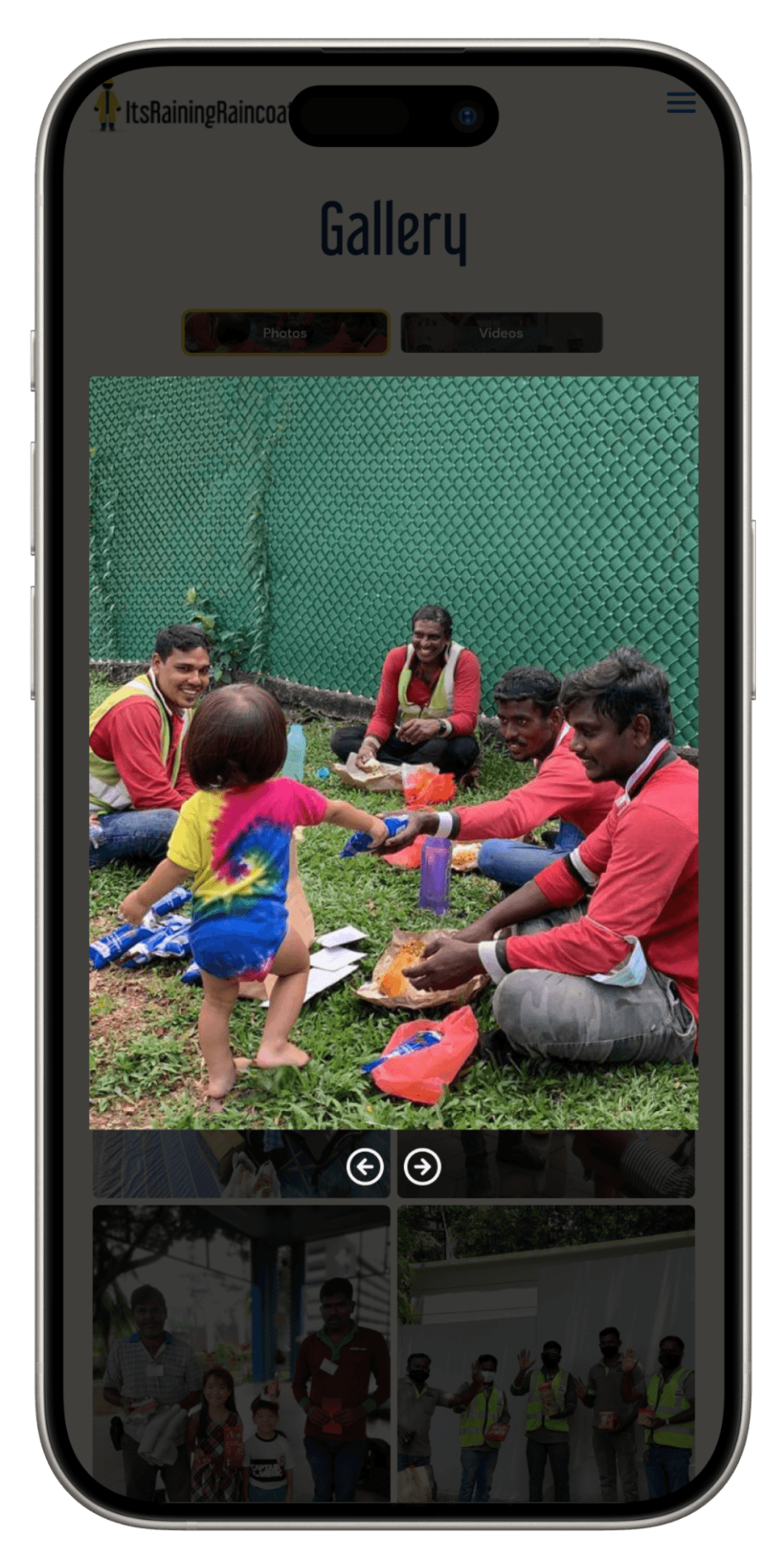
Galley Page - Photo - Expanded Photo

Homepage - Gallery Section

Gallery Page - Photo

Gallery Page - Video

Galley Page - Photo - Expanded Photo

Homepage - Gallery Section

Gallery Page - Photo

Gallery Page - Video

Galley Page - Photo - Expanded Photo

Homepage - Gallery Section

Gallery Page - Photo

Gallery Page - Video

Galley Page - Photo - Expanded Photo

Homepage - Gallery Section

Gallery Page - Photo

Gallery Page - Video

Galley Page - Photo - Expanded Photo

Homepage - Gallery Section

Gallery Page - Photo

Gallery Page - Video

Galley Page - Photo - Expanded Photo

Homepage - Gallery Section

Gallery Page - Photo

Gallery Page - Video

Galley Page - Photo - Expanded Photo

Homepage - Gallery Section

Gallery Page - Photo

Gallery Page - Video

Galley Page - Photo - Expanded Photo
Display of Organisations' Mission and Value
Display of Organisations' Mission and Value
Display of Organisations' Mission and Value
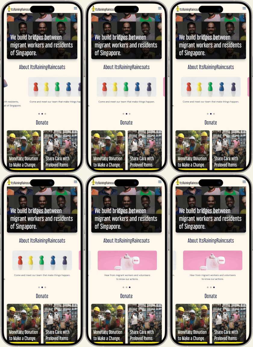
Homepage - About Us

Our Missions and Goals Page
Consolidated Workflows
Consolidated Workflows
Consolidated Workflows
Program Details: Potential contributors prefer to commit only after knowing program-specific details, such as required commitment hours and expected outcomes.
Program Details: Potential contributors prefer to commit only after knowing program-specific details, such as required commitment hours and expected outcomes.
Program Details: Potential contributors prefer to commit only after knowing program-specific details, such as required commitment hours and expected outcomes.
The program-specific information is scattered around on multiple pages, which fatigued users.
The program-specific information is scattered around on multiple pages, which fatigued users.
The program-specific information is scattered around on multiple pages, which fatigued users.
To optimize both volunteer and donor user flows, we streamlined access to initiative details based on user feedback about the tedious effort of navigating multiple pages to collect necessary program information.
To optimize both volunteer and donor user flows, we streamlined access to initiative details based on user feedback about the tedious effort of navigating multiple pages to collect necessary program information.
Now, all relevant information, (including commitment hour, event location, event date, and more program-specific requirements), is consolidated into one or two pages, reducing clicks and improving accessibility.
Now, all relevant information, (including commitment hour, event location, event date, and more program-specific requirements), is consolidated into one or two pages, reducing clicks and improving accessibility.
Volunteer Program
Pre-Loved Item Donation
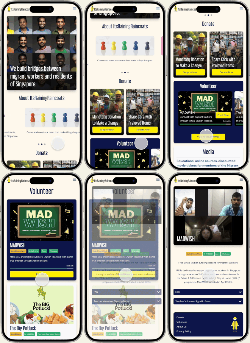
Access Volunteer Page Through Homepage

Access Volunteer Page Through Global Navigation
Key Screens
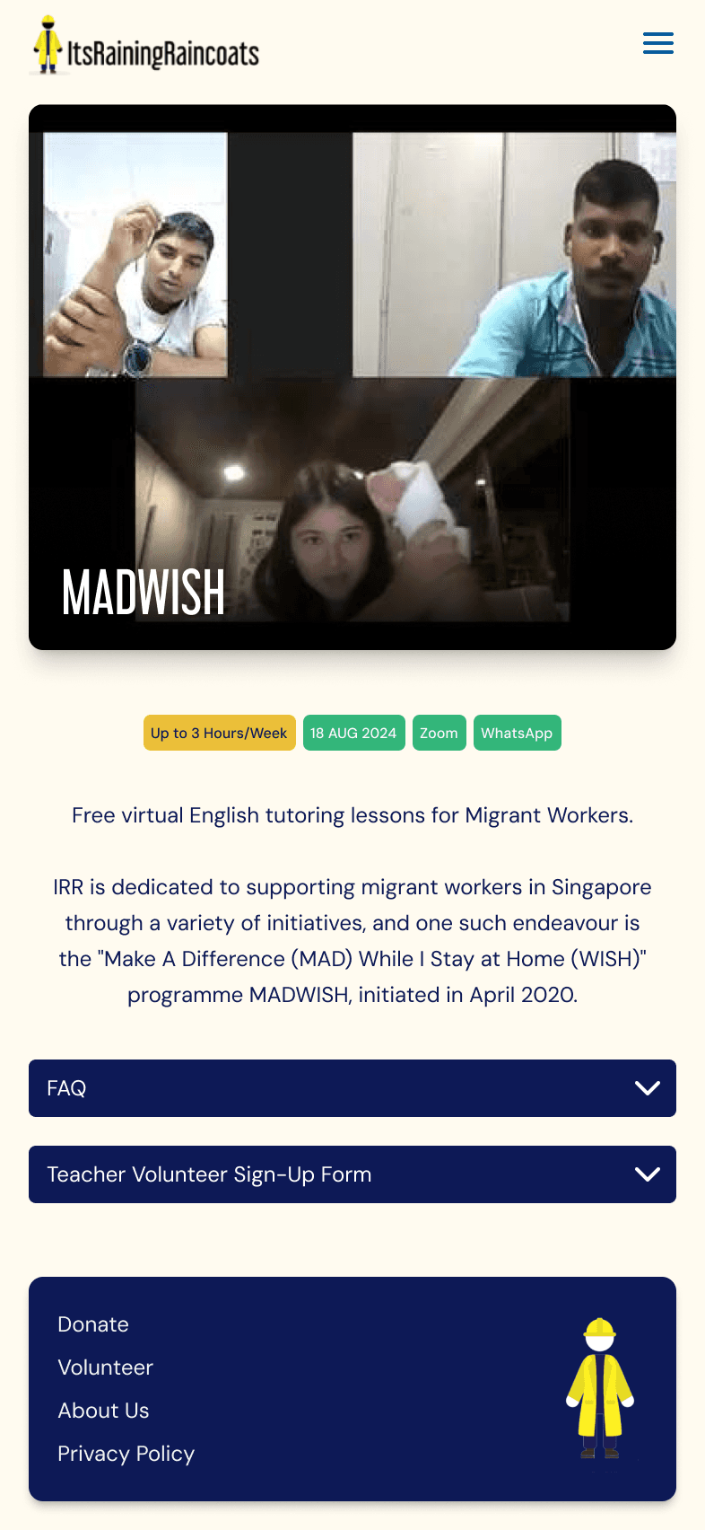
Volunteer Program - MadWish
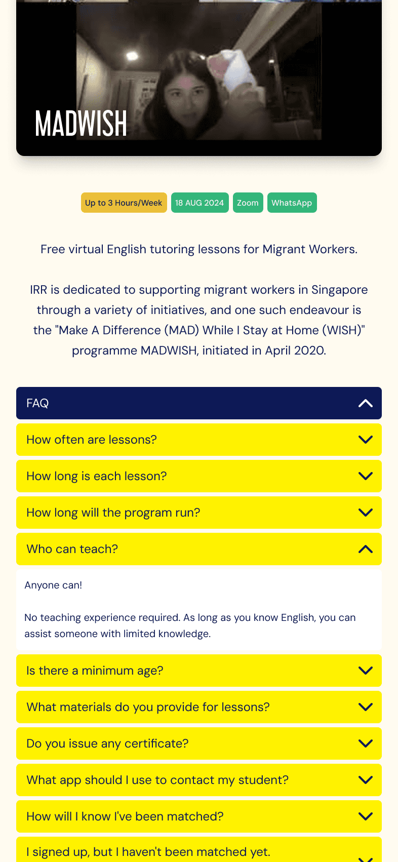
Volunteer Q&A Expanded
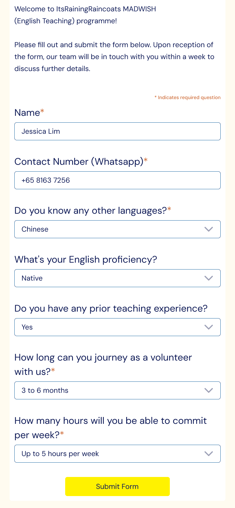
Volunteer Form
Volunteer Program
Pre-Loved Item Donation

Volunteer Program - MadWish

Volunteer Q&A Expanded

Volunteer Form
Usability Test
Usability Test
Usability Test
After completing the prototype, we conducted usability tests to validate its ease of use and overall satisfaction.
After completing the prototype, we conducted usability tests to validate its ease of use and overall satisfaction.
While all users successfully navigated the app, completed tasks with minimal errors and happy with their experience with the prototype, two key friction points emerged that disrupted the flow and extended task completion time.
While all users successfully navigated the app, completed tasks with minimal errors and happy with their experience with the prototype, two key friction points emerged that disrupted the flow and extended task completion time.
Friction Point 1: Users found the information in the acceptable pre-loved items list modal not immediately noticeable.
Friction Point 1: Users found the information in the acceptable pre-loved items list modal not immediately noticeable.
Current
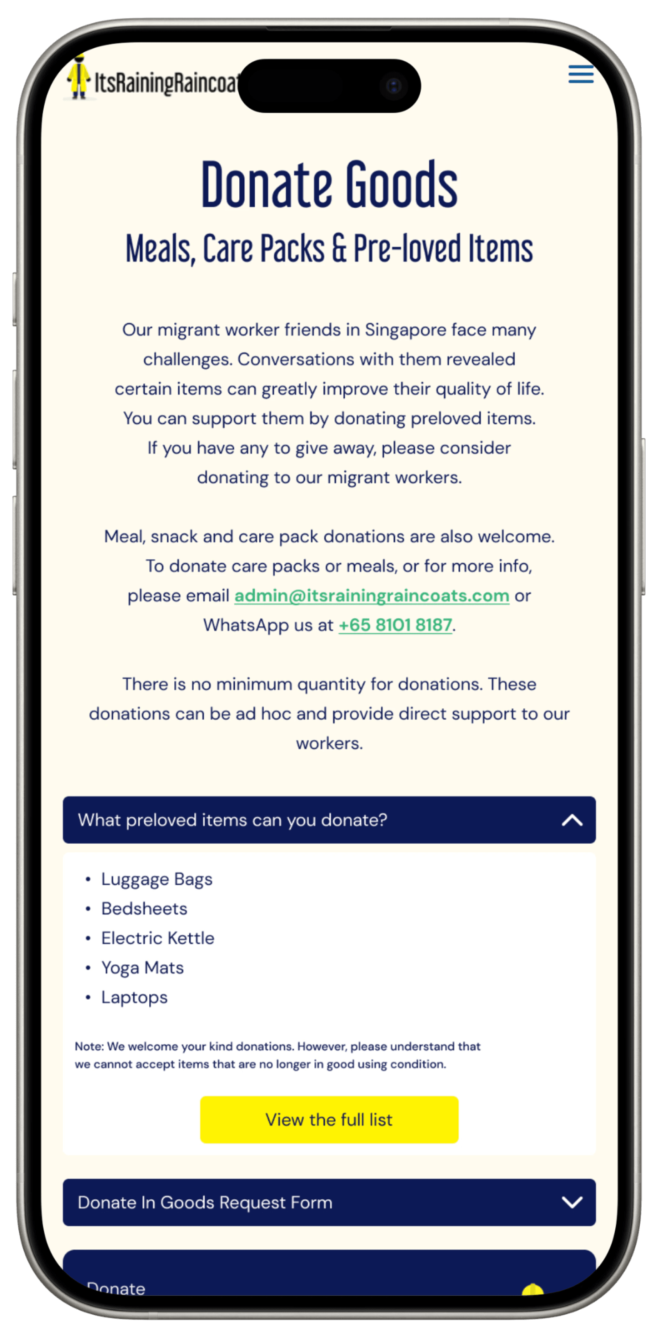
The small font size, coupled with the messy layout, proved difficult for users to search for keywords.
Reiteration

Improve accessibility by increasing the font size and adjusting layout of the list of items
Current

The small font size, coupled with the messy layout, proved difficult for users to search for keywords.
Reiteration

Improve accessibility by increasing the font size and adjusting layout of the list of items
Current

The small font size, coupled with the messy layout, proved difficult for users to search for keywords.
Reiteration

Improve accessibility by increasing the font size and adjusting layout of the list of items
Current

The small font size, coupled with the messy layout, proved difficult for users to search for keywords.
Reiteration

Improve accessibility by increasing the font size and adjusting layout of the list of items
Current

The small font size, coupled with the messy layout, proved difficult for users to search for keywords.
Reiteration

Improve accessibility by increasing the font size and adjusting layout of the list of items
Current

The small font size, coupled with the messy layout, proved difficult for users to search for keywords.
Reiteration

Improve accessibility by increasing the font size and adjusting layout of the list of items
Current

The small font size, coupled with the messy layout, proved difficult for users to search for keywords.
Reiteration

Improve accessibility by increasing the font size and adjusting layout of the list of items
Current

The small font size, coupled with the messy layout, proved difficult for users to search for keywords.
Reiteration

Improve accessibility by increasing the font size and adjusting layout of the list of items
Friction Point 2: Users found it difficult to find specific pre-loved item name quickly.
Friction Point 2: Users found it difficult to find specific pre-loved item name quickly.
Current
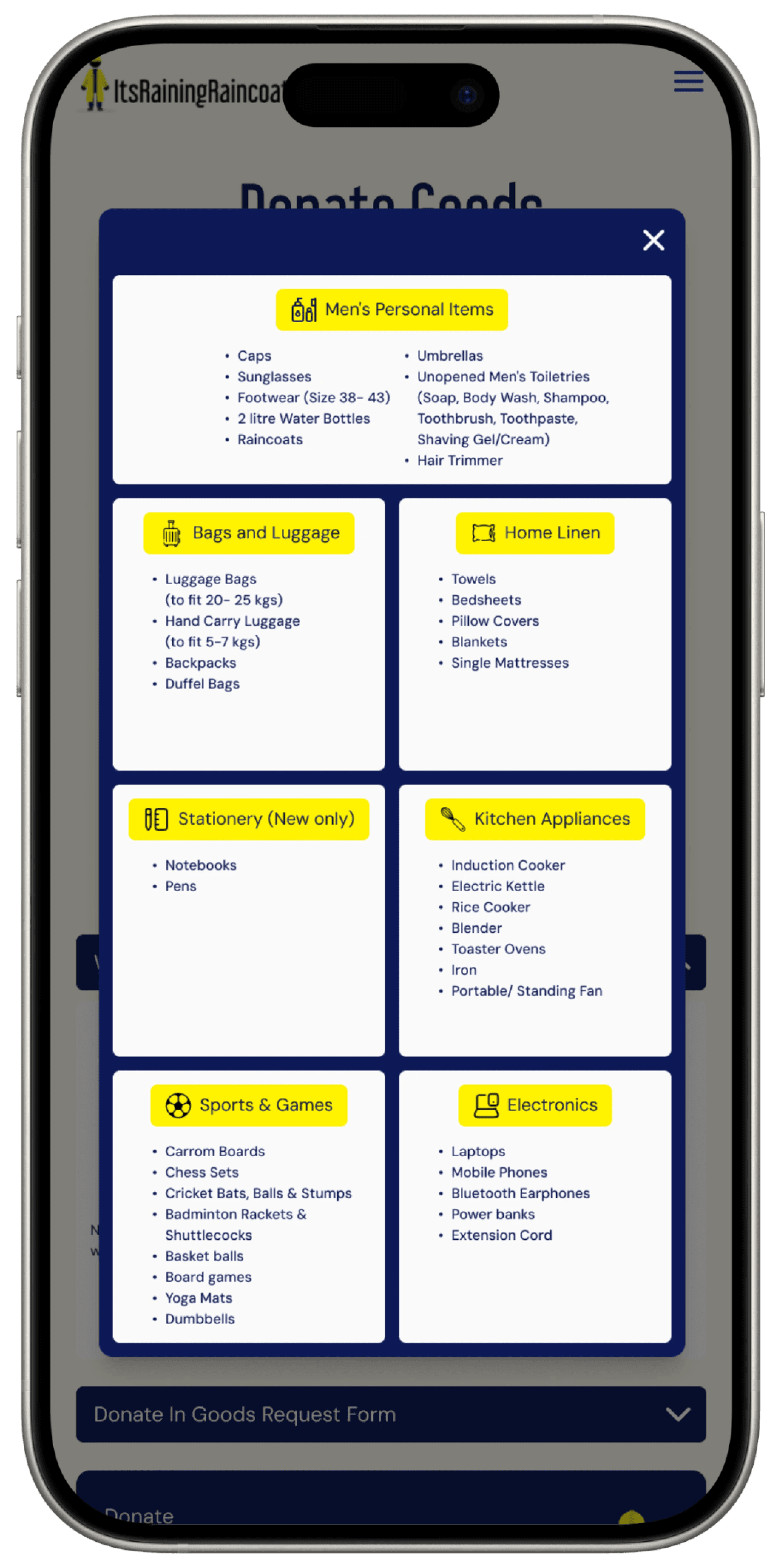
The full Donation List contains a lot of items and the current layout doesn't make it easy for users to scan through and find a specific item name.
Reiteration
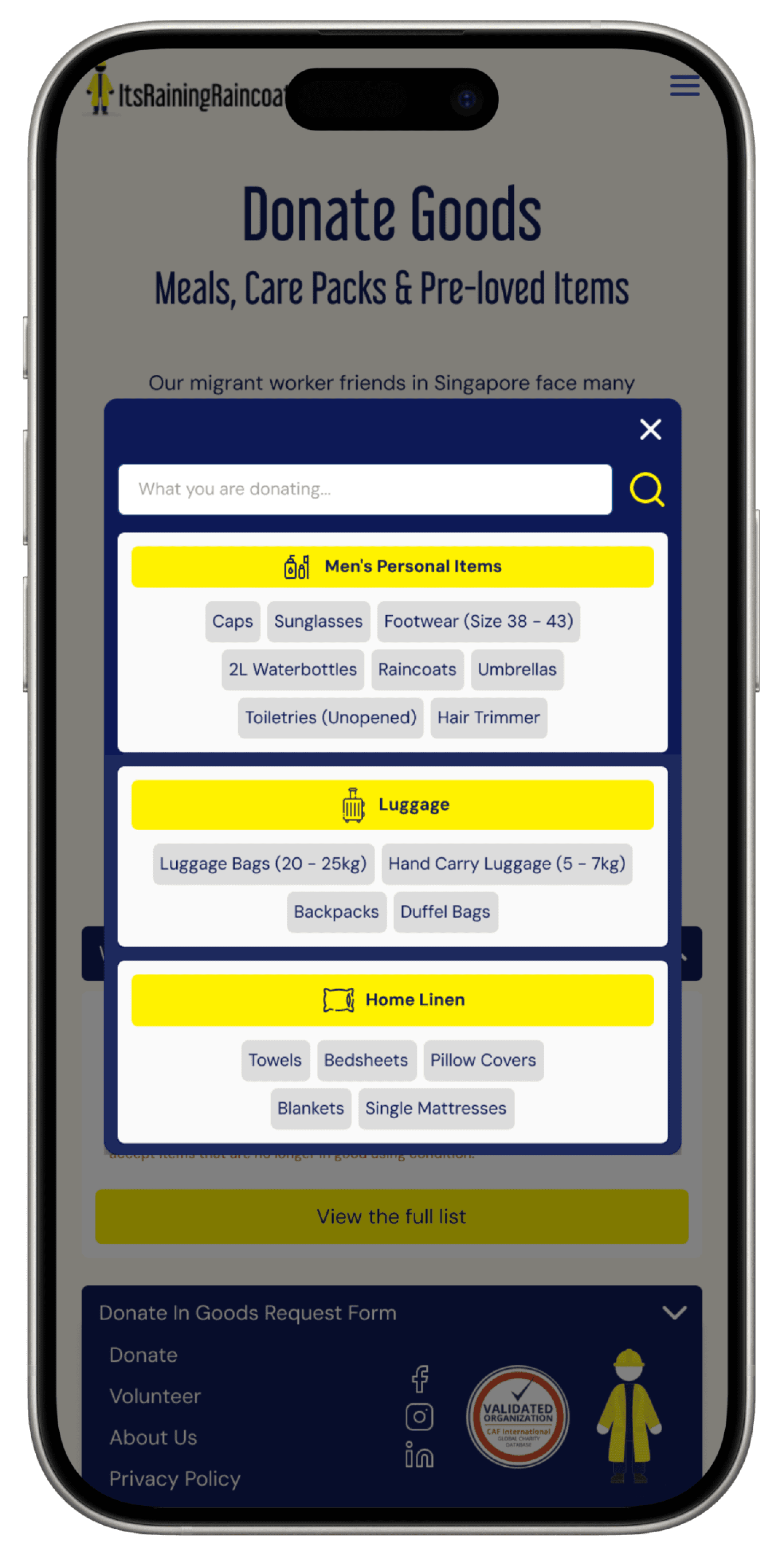
The reiteration revised the layout and increased the contrast of the design. It also allows users to find item name by searching.
Current

The full Donation List contains a lot of items and the current layout doesn't make it easy for users to scan through and find a specific item name.
Reiteration

The reiteration revised the layout and increased the contrast of the design. It also allows users to find item name by searching.
Current

The full Donation List contains a lot of items and the current layout doesn't make it easy for users to scan through and find a specific item name.
Reiteration

The reiteration revised the layout and increased the contrast of the design. It also allows users to find item name by searching.
Current

The full Donation List contains a lot of items and the current layout doesn't make it easy for users to scan through and find a specific item name.
Reiteration

The reiteration revised the layout and increased the contrast of the design. It also allows users to find item name by searching.
Current

The full Donation List contains a lot of items and the current layout doesn't make it easy for users to scan through and find a specific item name.
Reiteration

The reiteration revised the layout and increased the contrast of the design. It also allows users to find item name by searching.
Current

The full Donation List contains a lot of items and the current layout doesn't make it easy for users to scan through and find a specific item name.
Reiteration

The reiteration revised the layout and increased the contrast of the design. It also allows users to find item name by searching.
Current

The full Donation List contains a lot of items and the current layout doesn't make it easy for users to scan through and find a specific item name.
Reiteration

The reiteration revised the layout and increased the contrast of the design. It also allows users to find item name by searching.
Current

The full Donation List contains a lot of items and the current layout doesn't make it easy for users to scan through and find a specific item name.
Reiteration

The reiteration revised the layout and increased the contrast of the design. It also allows users to find item name by searching.
Reflection
Reflection
Reflection
This project was my first experience as both project manager and designer. Huge thanks to my colleagues, Fabian and Rizmiya, for trusting me in this role; I gained invaluable experience working alongside them.
This project was my first experience as both project manager and designer. Huge thanks to my colleagues, Fabian and Rizmiya, for trusting me in this role; I gained invaluable experience working alongside them.
Balancing both roles proved more challenging than expected, as I had to carefully manage my time between project oversight and UX research and design. Initially, I underestimated the effort required to organize, track, and allocate tasks, often spending more time than anticipated keeping the project on schedule.
Balancing both roles proved more challenging than expected, as I had to carefully manage my time between project oversight and UX research and design. Initially, I underestimated the effort required to organize, track, and allocate tasks, often spending more time than anticipated keeping the project on schedule.
To streamline our progress, I implemented a project tracker to ensure an organized and transparent workflow. This tool helped manage assignments and deadlines while tagging responsibilities, clarifying ownership, and reducing unnecessary back-and-forth as deadlines neared.
To streamline our progress, I implemented a project tracker to ensure an organized and transparent workflow. This tool helped manage assignments and deadlines while tagging responsibilities, clarifying ownership, and reducing unnecessary back-and-forth as deadlines neared.
Through this project, I also learned the importance of compromise. In time-sensitive projects, moving forward with an agreed-upon solution—even if it means setting aside personal preferences—helps maintain alignment and avoids prolonged debates.
Through this project, I also learned the importance of compromise. In time-sensitive projects, moving forward with an agreed-upon solution—even if it means setting aside personal preferences—helps maintain alignment and avoids prolonged debates.
Reflecting on the experience, I resonate with the Confucian thought 三人行必有我师焉: "Among three people walking, there will always be someone I can learn from." I adopted Fabian's meticulous approach to organizing design documentation and was inspired by Rizmiya’s adaptive interview techniques for diverse audiences. These lessons will continue to shape my UX design journey.
Reflecting on the experience, I resonate with the Confucian thought 三人行必有我师焉: "Among three people walking, there will always be someone I can learn from." I adopted Fabian's meticulous approach to organizing design documentation and was inspired by Rizmiya’s adaptive interview techniques for diverse audiences. These lessons will continue to shape my UX design journey.
Sooo…Shall we dance?
Sooo…Shall we dance?
Sooo…Shall we dance?
Let's connect and craft some wonders together
Let's connect and craft some wonders together
Let's connect and craft some wonders together

©2024 All Rights Reserved
